Breaking a Stereotype
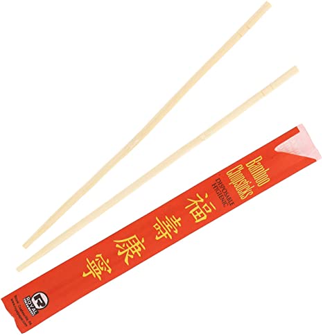
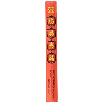
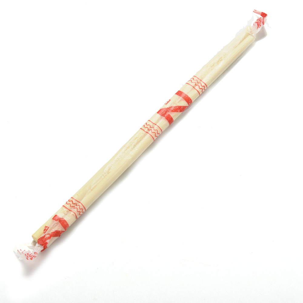
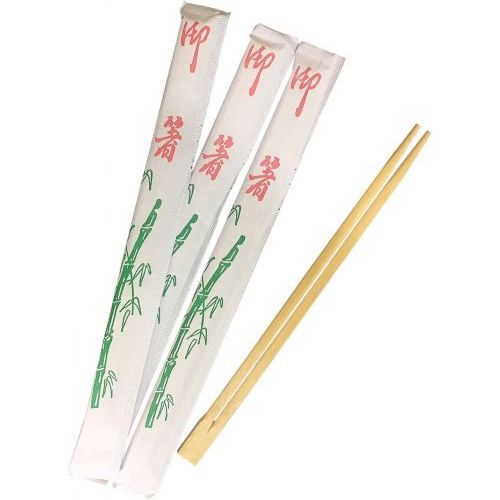
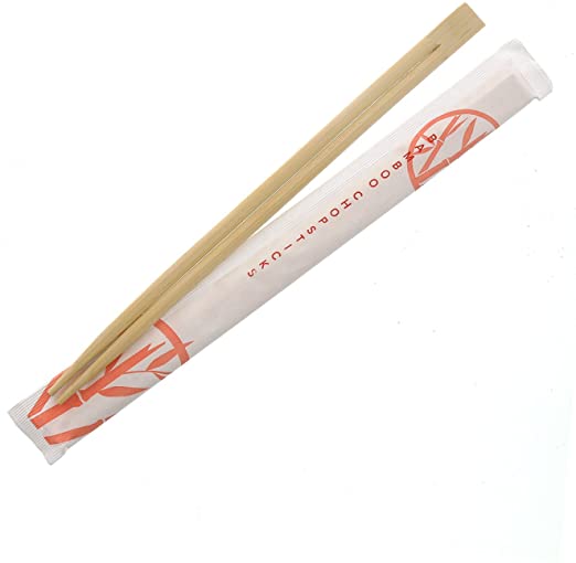
When we hear “takeout chopsticks”, it is easy to imagine these designs:
![]()
![]()
![]()
![]()
![]()
![]()
![]()
![]()
Why are they usually designed within the similar aesthetic? There is no rules or guidelines for these chopstick case designs. Isn’t this due to the stereotype on Asian culture?
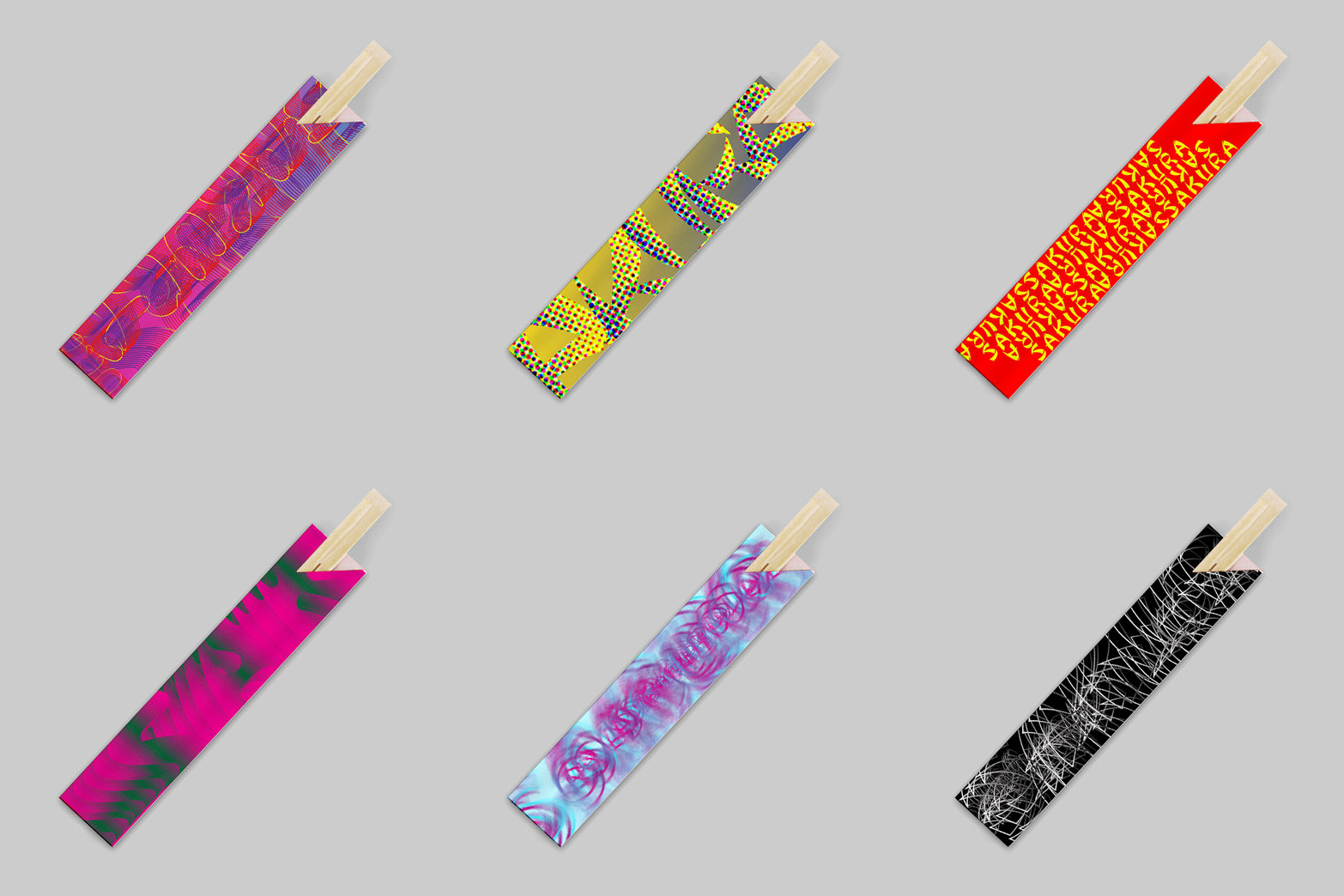
These are redesigned chopsticks cases with the distorted Chop Suey lettering forms:
![]()
![]()
Do they still look stereotypical?
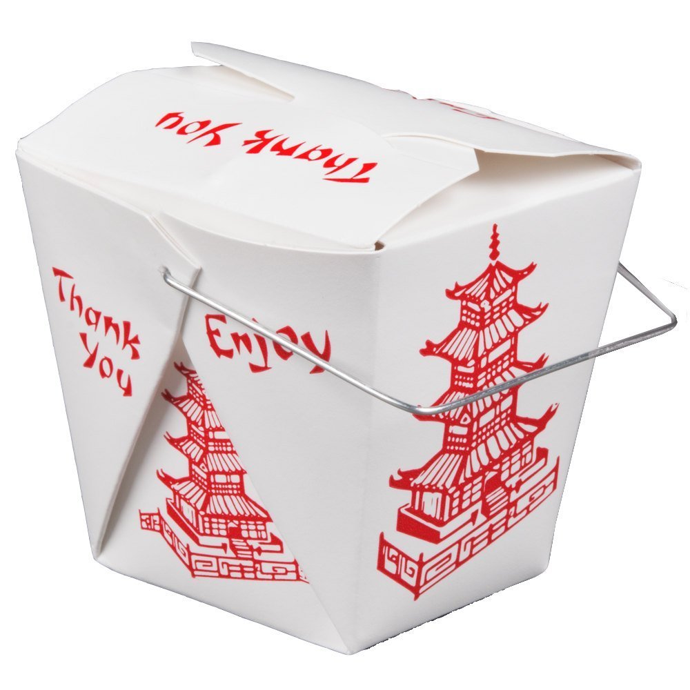
This is the classic take out box from Asian restaurants that we think of:
![]()
These are re-designed takeout boxes with different typefaces : Do they still convey the same connotation as the classic take out box design that uses Chop Suey font? How does box shape change the meaning of “takeout box”, and how does does color affect it?
![]()



These are redesigned chopsticks cases with the distorted Chop Suey lettering forms:
Do they still look stereotypical?
This is the classic take out box from Asian restaurants that we think of:
This is the classic take out box from Asian restaurants that we think of:
How does box shape change the meaning of “takeout box”, and how does does color affect it?

